Becoming a log of wood
With František Štorm about book design and typography
We asked graphic and typography designer, as well as singer and guitar player of the worldwide-known black metal group Master’s Hammer about his inspirations, who is the top of today’s Czech typography and how he perceives the utilization of his scripts. We also talked about his unconventional pedagogical methods and magic of wood engraving.
„In the legend about script, he is one of the protagonists; he is the founding father of local digitalized typography; a leader; a great steersman; a general; a beloved comrade of Czech script at once.“ This is how your former colleagues at The Academy of Arts, Architecture and Design in Prague (UMPRUM in Czech) describe you.
To cite Stalinist titles is nonsense. I am humble on the outside, but in the studio, my ego is where it belongs in: above it all.
You trained at UMPRUM, under Milan Hegar and then Jan Solpera. Both your teachers were former students of František Muzika. What influence did these important book designers have on you?
Studies slowed me down in playing black metal; a genre I discovered in my first year thanks to similarly afflicted classmates. Hegar was horribly conformist and so his lessons were like that: we were made to create posters for various communist anniversaries and spend three weeks drawing a dry leaf with a sharp pencil. We had no clue what we were doing there. I wanted to leave. But Solpera came at the right time and gave a real sense to the training. He required that we leave our own imprint in applied art. All of us in the studio came alive then and started doing something.
How was book design taught under Hegar and Solera and how was it taught when you led the same department? Could you describe some concrete examples? Today, book design is not taught at all at UMPRUM.
If I am not mistaken, book design is taught in three studios at UMPRUM. For better or worse, the greatest stars are the autodidacts, after all: Oldřich Hlavsa, Josef Týfa, Robert V. Novák and others. I am an autodidact in music and best in the chosen style precisely for the reason that I cannot read the notes. The slogan valid during my tenure as the head of the studio at UMPRUM was „do not be afraid to slack it“ and those who adhered to it did best. To elaborate on this pedagogical jewel a bit further, then most important is expression and impact on the viewer. It is crucial to develop distaste for slave work. We had a good opportunity to test this on the normal people, and not only on the members of internal school committees, when we showed students’ work in the countryside, for example in Bítov or St. Gallen.
Have you been following the work of your former students? Can you remind us of some of their names?
Of course! Jan Čumlivski, Tomáš Brousil, Martina Nováková, Anička Pleštilová, those are artists whose work inspires me, too. They can be seen and sometimes even heard.
Since script substantially influences the book, you are, to an extent, also a designer of every book that utilizes your script. Do you not suffer when you witness how your scripts are utilized and what they are utilized for?
I only suffer by my own creative struggles. What happens to my work after it leaves the studio is none of my business; particularly if someone is willing to pay and I can carve out precious moments of freedom and paint whatever I feel like painting. Script lives its own life and snowballs various unexpected connotations. Let us consider broken script, for example – how is it that such a calm, gothic script became such a monster feared until today?
What is the most important thing when creating a script?
Legibility.
When illustrating books or delivering a motive for the cover, you often make use of wood engraving. Why do you like it so much?
When I was young, I was quite fond of illustrations by Gustav Dobrý and of course Verne’s books. I own the complete series of Brehm’s Life of animals; full of xylographs. These are magically perfect illustrations with great details. There’s the devil in details. When I was a little kid, I would look at them for a long time because there is so much to look at, and this is how I approach illustration even today: a theme needs to be retold for the eyes; artistically finished. Wood engraving is a beautiful technique in complete silence; for engraving has manic sounds, not the unlike metal brushes that are used for the distorted guitar. I am becoming a log of wood and long for a coat of paint and squeeze between the drums and embrace of a sheet of paper.
What led you to design scripts? Is there some sort of idea of a book or a poster that utilizes the script or is it pure joy of creating the alphabet?
The reason I got to fonts was an unsatisfactory selection of computer fonts in the early 1990s. I love creating fonts for music, for example Mortal Cabinet, Necrocock or Master’s Hammer…
Have you been leaning toward anyone from the typography field?
My most favorite is eccentric Eric Gill. What an excellent example of how one can go crazy doing precious craft. But, of course, in the best sense of the word: he has developed his eccentricity for the better of us all.
Is there a script that you always prefer to others? If only one script was to remain, what would it be?
To a deserted island I would take a set of simple script with Menhart so that I would not suffer too long and had this gotten away with in no time. This is similar to when you ask a painter what is their most favorite color or ideal width of a brush.
What is your idea of the ideal book?
I have always admired the baroque typography for its expression, execution, and mysticism. I love heavy leather binding and golden book edges.
What are your favorite books, based on design?
There is one faithful user of our fonts who often brings me his beautiful work and I jokingly tell him that he needs to throw in extra money for the carpenter who would make new bookshelves since I have no room for more books. So when it comes to books, what I value most is accessibility; I have no time to be looking for things. I got the kindle reader, download texts for illustrations, specialized texts from the Internet, philosophy, articles… and read these comfortably on the screen, then discard. I do not want my home to be a warehouse.
Have you been following contemporary book design? Have you noticed any sort of move, whether negative or positive?
I have tried not to follow what does not concern me. The quality is to be evaluated by critics, for it is their job, and readers, for it is their good or bad taste. It is always for the better when a publisher has an art department or at least someone who focuses on and concerns with this.
What book would you like to design on your own? What is your book dream?
In my dreams I prefer the dirty stuff, even as the dreams sometimes include work. Right now, I am working on illustrations for Dracula for Argo Publishers; it is a beautiful, classic story. In general, I can say that everything I have done in the field of bookmaking was what I have also enjoyed.
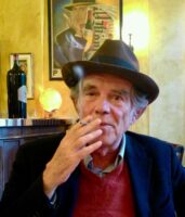
František Štorm (born 1966) is a Czech writer, typographer, graphic designer, pedagogue and musician. He studied at SOŠV in Prague between 1981-1985. He continued his studies at the Academy of Arts, Architecture and Design in Prague, first led by Milan Hegar and later Jan Solpera, in which he graduated in 1991. In 2003-2008 he was the Head of the Studio of Type Design and Typography at the same school.
Newsletter Ádvojky přímo do vaší schránky
odebírat newsletter A2
Příbuzné články
Gianfranco Sanguinetti, 1948–2025
The Prague Mystifier of the Italian Ruling Classes